Let's take this VERY unimpressive snapshot which I actually scanned into my computer (hmm, let's start with that...I scan at 600 ppi in TIFF format - this allows me to have a higher-quality original if I want to do something with it later. Before any editing, I change that 600 ppi TIFF into a highest-quality, 300-ppi JPEG). So I've done that, and this is what I have. Too orange, blurry, grainy...not too impressive, but not horrible.

The first thing I ALWAYS do is adjust levels - not automatically, but manually. In PSE, that is Ctrl+L. Particularly when scanning, there is generally some "empty" areas at the lightest (right) side and darkest (left) side of the histogram (that's that mountain/hilly looking thing). So the first thing I do is slide the sliders (the little triangles at the bottom) for the two outside levels in to where there is actually some "hill" - see what I mean here.


With preview box selected, I mess around with the sliders until the photo looks the way I want it. More or less. I know I will be adjusting this stuff again later, so for now, I'm happy with this. So the next thing I want to take care of is this horrible orange tint! The first thing I will always try is removing a color cast, because if that works, bam! Done in one simple click. Go to the menu Enhance, Adjust Color, Remove Color Cast, and here's what you get (that box down there). I chose the refrigerator from the background as the "white" spot, and I think if anything it looks MORE orange! I tried a few other things, none worked, so I hit cancel, and will go on to the next option.

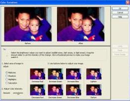
This can be found under Enhance, Adjust Color, Color Variations. You can see your "before", and the "after" which changes as you make selections. On the bottom is a nice grid showing what options you have...

99.99% of the time, I leave the area to adjust at midtones, but the Color Intensity needs to be de-intensified by sliding the slider down to the beginning, in order to make small changes. See how the options all mellow out after you move this? That's okay, because you can click the same thing as many times as you want, and it will change in those small increments.

so I chose "reduce red" two times, and this was the result.

Better, but I will be revisiting the color variations again, I think.
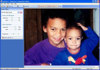
The next thing to take care of is NOISE! Do you notice, unless you have some fabulous camera that I don't (which you very well may, mine is a very inexpensive point & shoot) that if you try to fix the color, especially if you make it lighter, you have all these little color dots, teeny-tiny little dots, that make the picture look....not smooth? That is called noise, and one of the greatest days of my life was when I discovered this product called Noiseware. You can buy a version and work with it right in PSE, but I have the free one, so now I save my pic as a highest-quality JPEG, close it, and open my Noiseware program, and plop the partially-edited photo into the program. Viola!

 Notice all the nifty little sliders on the left side - I'm not going to go deeply into them, you can play with them to your heart's content if you download the free version, I'll just tell you what I do.
When you hit the drop-down box, you have choices besides "Default" and I always at least begin by choosing Full Suppression (stronger noise).
 After choosing that, I choose +2 or +3 sharpening. I do this to prevent the noise suppression from possibly suppressing too much of the detail (eyes and hair mainly).
I click on "go" and here is what I get. To see what it begin as, I simply click on the picture. Then I can decide - did I get it right? If not, hit undo and try different settings. Usually what I do is click on the picture and amaze myself with what a great job the noiseware did for me! It is really amazing!
 So after being all amazed for awhile, I choose "save as" and leave the default, which is the same file name with "_filtered" added - I always keep the original for awhile, just in case. Just in case what, I don't know...but still...
 There, that's just so nice and smooth and lovely - but now it's REALLY orangey! For some reason, running this filter tends to make my pix redder. So my first step is generally to go back to color variations.
 So after clicking "Decrease Red" so many times I lost count, I decided to bump my little intensity slider up one step, click on Reset Image, and began again. Then I clicked "Reduce Red" 3 times, and was happy with the result.
Now I decided that fridge (which did me no good as a white spot ANYWAY) is too distracting - needs to go. So I choose my crop tool, and crop it out (along with some irrelevant dark stuff, too).


Much better!
Now one thing about reducing noise is that it also reduces sharpness. And the pic wasn't too sharp to begin with! By sharp, I mean...well, let me show you.
 Over in your palettes, there's the Effects palette, and under a bunch of artistic-type effects, you will find "Unsharp Mask". This little box is what it looks like. The little close-up sample looks awful, but I ignore that and watch the full photo on the screen. I generally start out with settings of 100, 10, 5. Exactly what they mean I could not tell you, but I do know that the last one sort of "undoes" the first ones partially. If I choose 100 and 10, some of the pic looks great, but the faces tend to actually get splotchy. Choosing 5 in the last box softens them back up a bit. It's something you really just have to play with! But by clicking the preview box on and off, you can see the difference. What I really want to do is make the eyes pop, clarify any lines that are a little muddled, see the purdy smiles, and the hair. So I was happy with these settings. I'm practically finished!
But see the little specks all over? I'm not going into a long description how to use the clone stamp and blending tools (the one that looks like a band-aid) but maybe in another tutorial...
 See that really obvious speck? I use my stamp tool, pick a non-speck spot near the speck, set opacity to 90% (or more or less depending on my needs) and stamp it out!
 Viola!
Now I could go thru and do that to all the little specks, and I may just do so if I'm going to scrap this page, but you get the idea. And I'm sure you don't want to watch me do all that!
So here is the Before & After Pic - see how much better it looks? Better color, no graininess, sharper eyes and smiles, just better!

Okay, I have never done a tutorial before in my life, and the only reason I chose this specific subject is because I have gotten comments on how nice and smooth, sharp, crisp, clear, blah blah blah, my pix look, so I figured I'd take you thru my own personal, messy, sometimes downright arbitrary editing process. If you decide to edit pix like me, you will almost immediately change some of the steps to suit your taste, your camera, your screen, your kids, your whatever! And you should! And if in doing so, you come up with some FABULOUS idea, be sure to post a comment and let me know! I'd love to learn from you, too!
If anything about this tutorial was difficult to read/follow, also leave a comment (but gently, please, this is my VERY first effort), so I can improve my ability to share with you what I do!
Thanks for checking out my Tuesday Tutorial at Bouquet of Pixels blog!


1 comment:
Great tut! Thanks for taking the time to put this together!
Post a Comment